NOTION – WORLD TOUR IDENTITY
NOTION – WORLD TOUR IDENTITY
Notion – World Tour Identity
Creative Direction & Graphic Designer: Ben Brook
Custom Lettering & Logotype: Joshua James Saunders
With thanks to: Sam Dixon & Rhys Loydall
www.notiondj.world
> Designing (then breaking) a grid system to form the basis of a modular image and type layout structure:
This cemented the style with consistency across full posters, regional posters and individual destination posters, all presented with a bespoke layout per each design.
Grid sizing was customisable and each poster could be formatted uniquely to layout background imagery and type for best legibility.
This design also allowed for new dates to be added after the initial launch of the campaign, which is often the case in the live music industry, and whilst the tour was promoted for many months would allow for any changes on the fly.
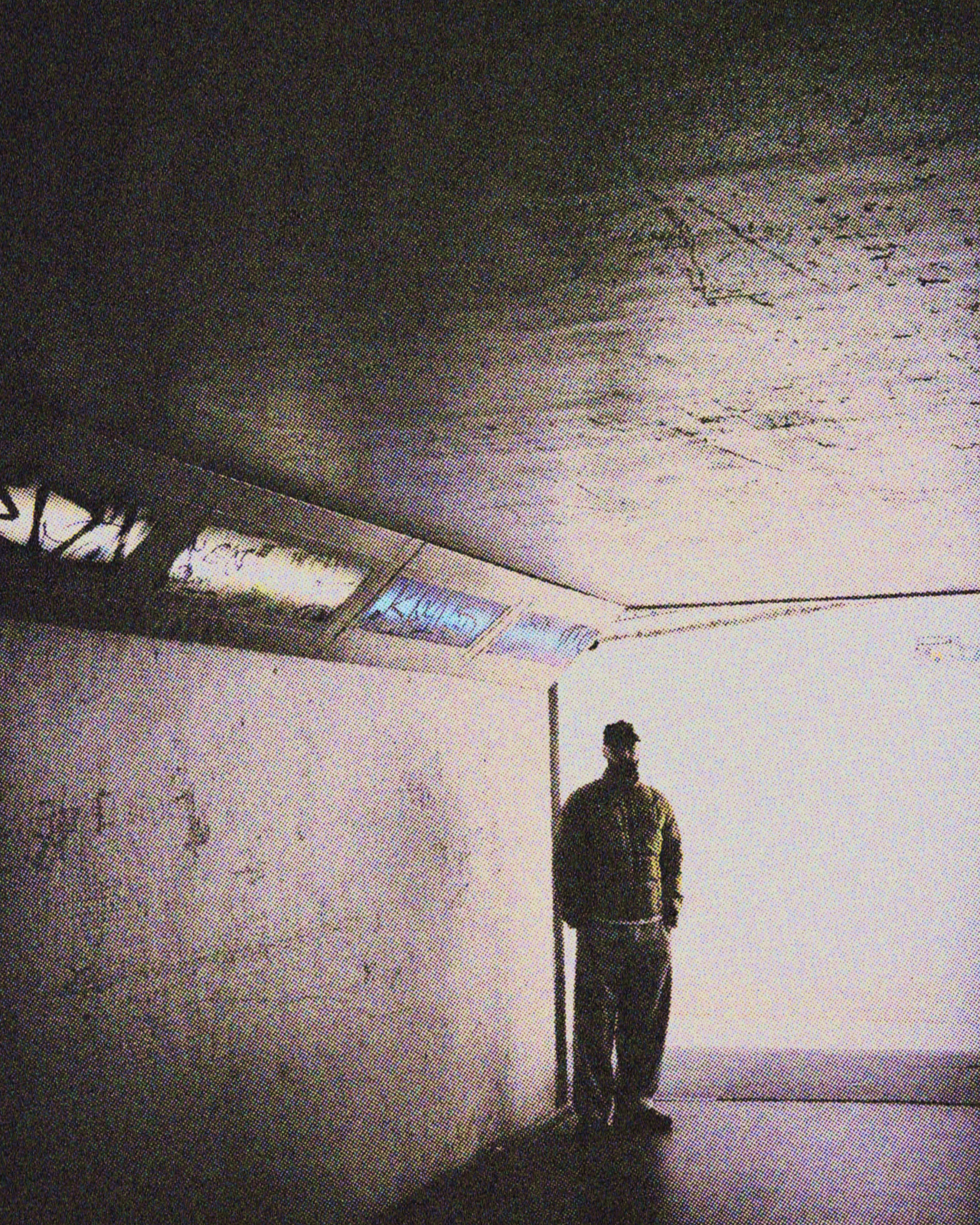
> Backgrounds consists of roaming street view imagery from each destination paired with looping visuals from the moving image world we’ve been building with Notion over the last few years.
A consistent texture and colour scheme tied all the locations and backgrounds together across each poster, whilst a different secondary colour scheme was applied to each individual destination in a complementary muted palette.
Supporting design assets, the tech-leaning glyphs, are a continuation of design and image treatment from the music videos and visualisers I made on Notions previous campaign “forwards”.
> The bespoke title logotype stemmed from initial 7x4 grid illustrations of the word “notion” that could be customisable in size and letter design.
This was finessed by Joshua James Saunders into rounded grid blocks, with a juxtaposing hand-drawn “World Tour” type, which was a style referenced in Notion’s initial briefing.


